Note!
The Myscanner Analytics are only available to users who have purchased the add-on.
Users
Basic Users
Basic users will need an admin to create a dashboard and either set the dashboard as the default dashboard across the organization, or “favourite” the dashboard themselves. Basic users will only be able to view dashboards and favourite dashboards that are made available to them.
Scan Editors/Admin users
Admin users will have all the same permissions as basic users but will have extra privileges such as creating, and editing dashboards.
View Dashboards
To view dashboards available to you, select the “Analytics” menu item from the left menu. This will open a sub-menu where you can manage anything related to Embedded Analytics
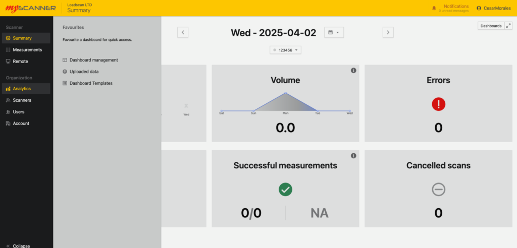
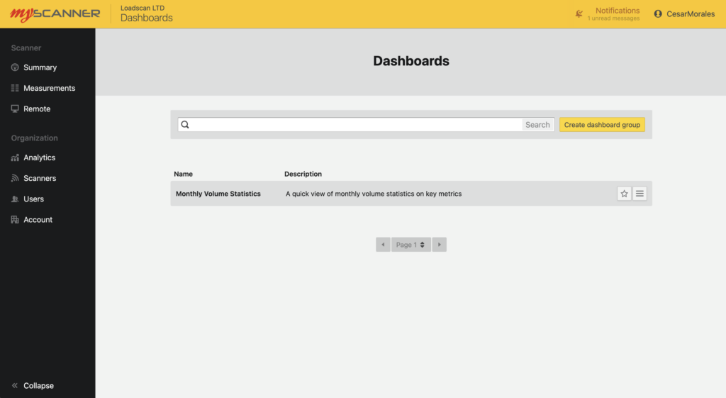
Basic users will be able to view dashboards, and favourite ![]() dashboards which will set the default home page view to the favourite dashboard.
dashboards which will set the default home page view to the favourite dashboard.
Admin users These users will still have the same features as basic users but will be able to create and edit dashboards. They will also have the ability to upload custom data and use previous templates.
Creating a Dashboard
Note!
This section will only be relevant to an organization admin.
To create a dashboard you will need to view dashboards and click the Create Dashboard Group Button ![]() .
.
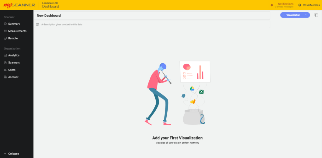
This will open a prompt where you will enter the name and a description of the dashboard you will create. After giving the dashboard a name, you will see a screen like so:
Adding a Visualization
To add a Visualization, click the blue button ![]() and it will open a dialog with some options.
and it will open a dialog with some options.
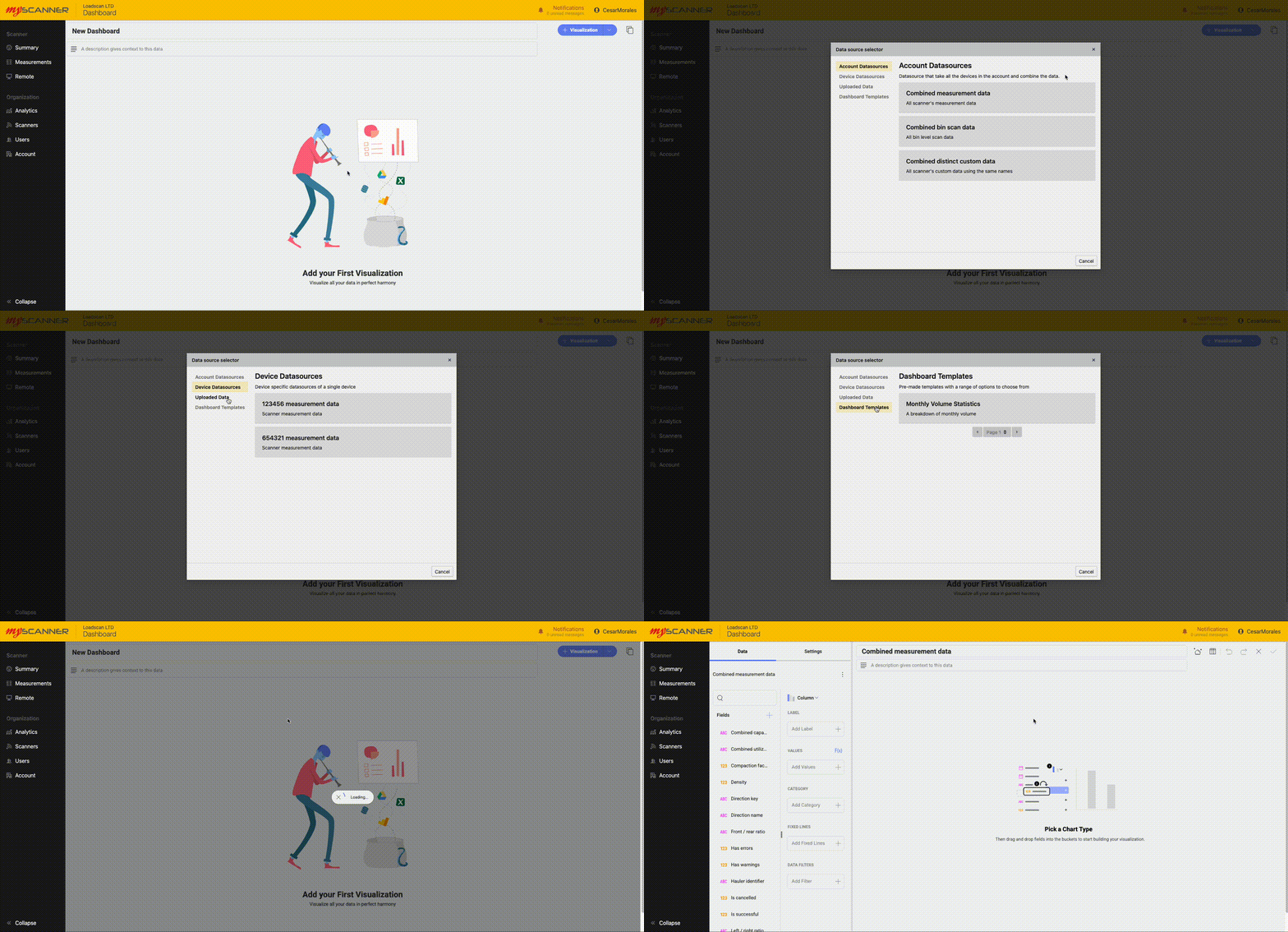
All the different tabs are groups of data types.
- Account Datsource: This is a set of datasources that combine closely related data from multiple devices.
- Device Datasource: This is a set of datasources that will be specific to one device.
- Uploaded Data: This is where you use data that has been uploaded from the “Uploaded Data” page. Uploaded data gives you the opportunity to link your own custom data to myscanner data.
- Dashboard Templates: These are entire dashboard templates that will overwrite the existing dashboard. If you select a dashboard template a selection of pre made visualizations will be created and auto-populated based on your own devices and data.
Editing a Visualization
You can drag and drop the fields or click on an option to add the field into different categories.
NOTE!
Different Charts will show different options so play around with the options and try out the different charts.
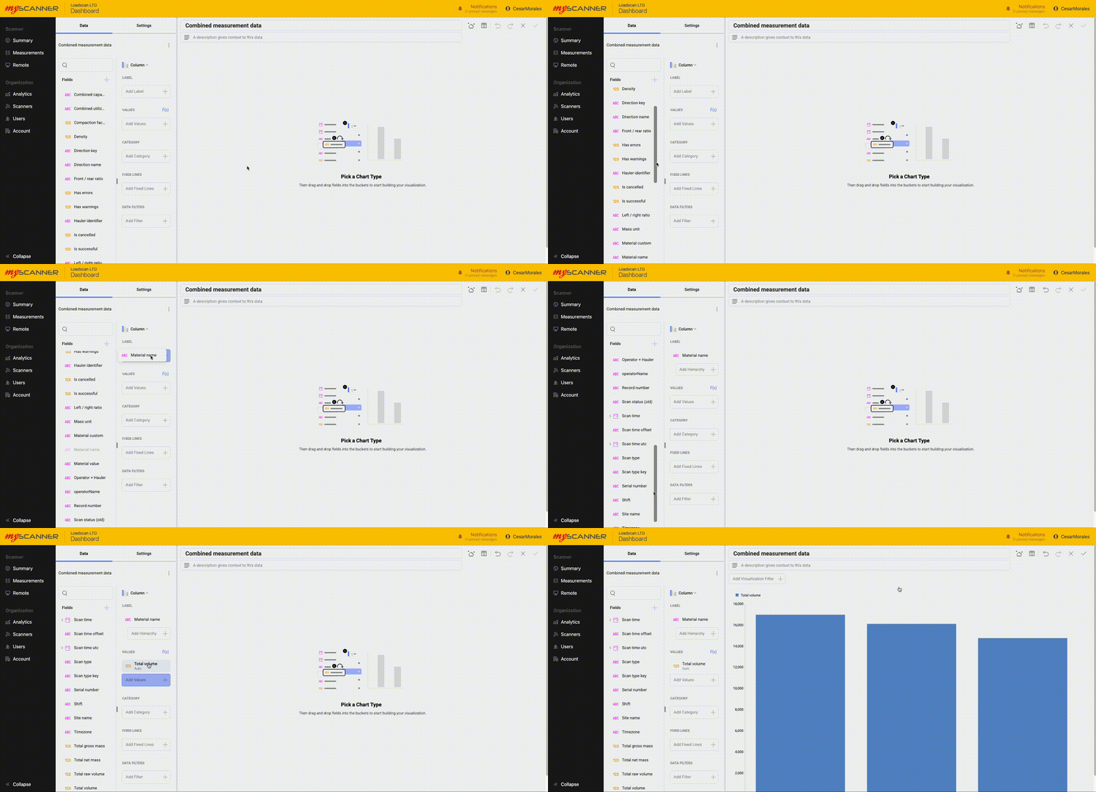
You can also adjust the settings of a visualization. Click the Settings button on the top left of the editing screen and take a look at the options available.
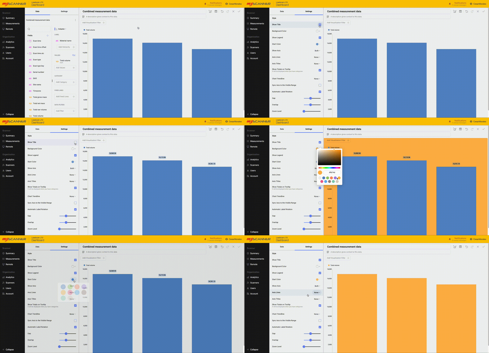
When you have finished making your visualization press the Save ![]() button. You can also Cancel
button. You can also Cancel ![]() your dashboard visualization or undo or redo
your dashboard visualization or undo or redo ![]() any changes.
any changes.
Saving the Dashboard
Note!
The dashboards do not auto-save, so make sure you save frequently if you are making a lot of changes.
Once you have made a visualization, you can save the dashboard. Simply press the tick ![]() at the top left to save the dashboard.
at the top left to save the dashboard.
Using Dashboard Templates
Note!
This section will only be relevant to an organization admin.
Dashboard templates are an easy way to get started. They are pre-made dashboards that will auto populate with your own data and give you a good starting place to start using dashboards in an effective way. Over time more and more dashboard templates will be added to MyScanner. When using the templates, make sure to save any dashboard you are currently working on. To start using the templates, simply click on “Visualizations” and then navigate to “Dashboard Templates”. This will show you a list of different templates with short descriptions. If you click on one of the templates, MyScanner will automatically create a new dashboard tab with all the data populated with your own data. Below is an example of using one of the templates:

Adding a Visualization
To add a Visualization, click the blue button ![]() and it will open a dialog with some options.
and it will open a dialog with some options.

All the different tabs are groups of data types.
- Account Datsource: This is a set of datasources that combine closely related data from multiple devices.
- Device Datasource: This is a set of datasources that will be specific to one device.
- Uploaded Data: This is where you use data that has been uploaded from the “Uploaded Data” page. Uploaded data gives you the opportunity to link your own custom data to myscanner data.
- Dashboard Templates: These are entire dashboard templates that will overwrite the existing dashboard. If you select a dashboard template a selection of pre made visualizations will be created and auto-populated based on your own devices and data.
Editing a Visualization
You can drag and drop the fields or click on an option to add the field into different categories.
NOTE!
Different Charts will show different options so play around with the options and try out the different charts.

You can also adjust the settings of a visualization. Click the Settings button on the top left of the editing screen and take a look at the options available.

When you have finished making your visualization press the Save ![]() button. You can also Cancel
button. You can also Cancel ![]() your dashboard visualization or undo or redo
your dashboard visualization or undo or redo ![]() any changes.
any changes.
Saving the Dashboard
Note!
The dashboards do not auto-save, so make sure you save frequently if you are making a lot of changes.
Once you have made a visualization, you can save the dashboard. Simply press the tick ![]() at the top left to save the dashboard.
at the top left to save the dashboard.
Managing Custom Data
Uploading Data
You can upload your own data to our dashboards that can work with MyScanner data. You will need to format your data into a CSV file. To upload a datasource, you must first save your dashboard, navigate to “Uploaded Data” and then upload a datasource from the page. You will need to then select a file to upload. Big files will take longer to upload and process within the system. Try to keep your files small so you don’t see any slowdowns.
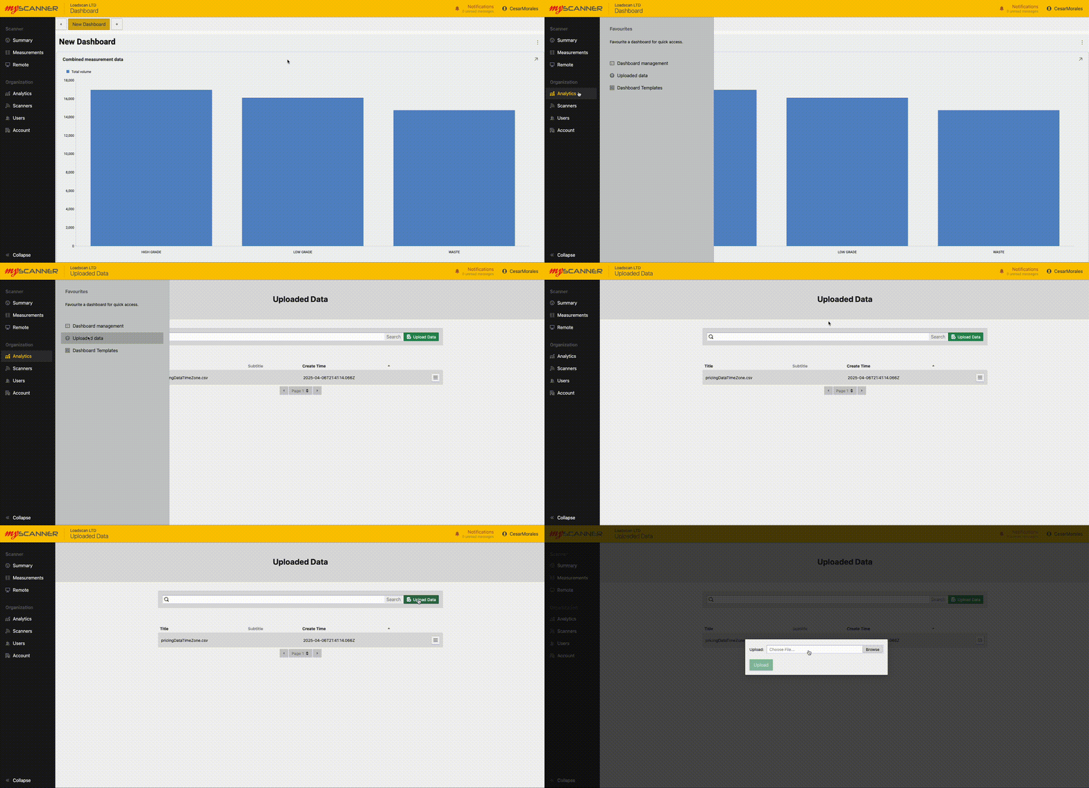
Once uploaded, You can start using the data as if it were any other data source.
Here is an example of joining our uploaded data to current scan data.
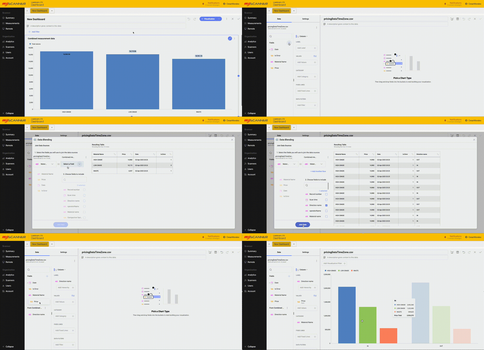
This is a pre-uploaded example.
Once uploaded, You can start using the data as if it were any other data source.
Here is an example of joining our uploaded data to current scan data.
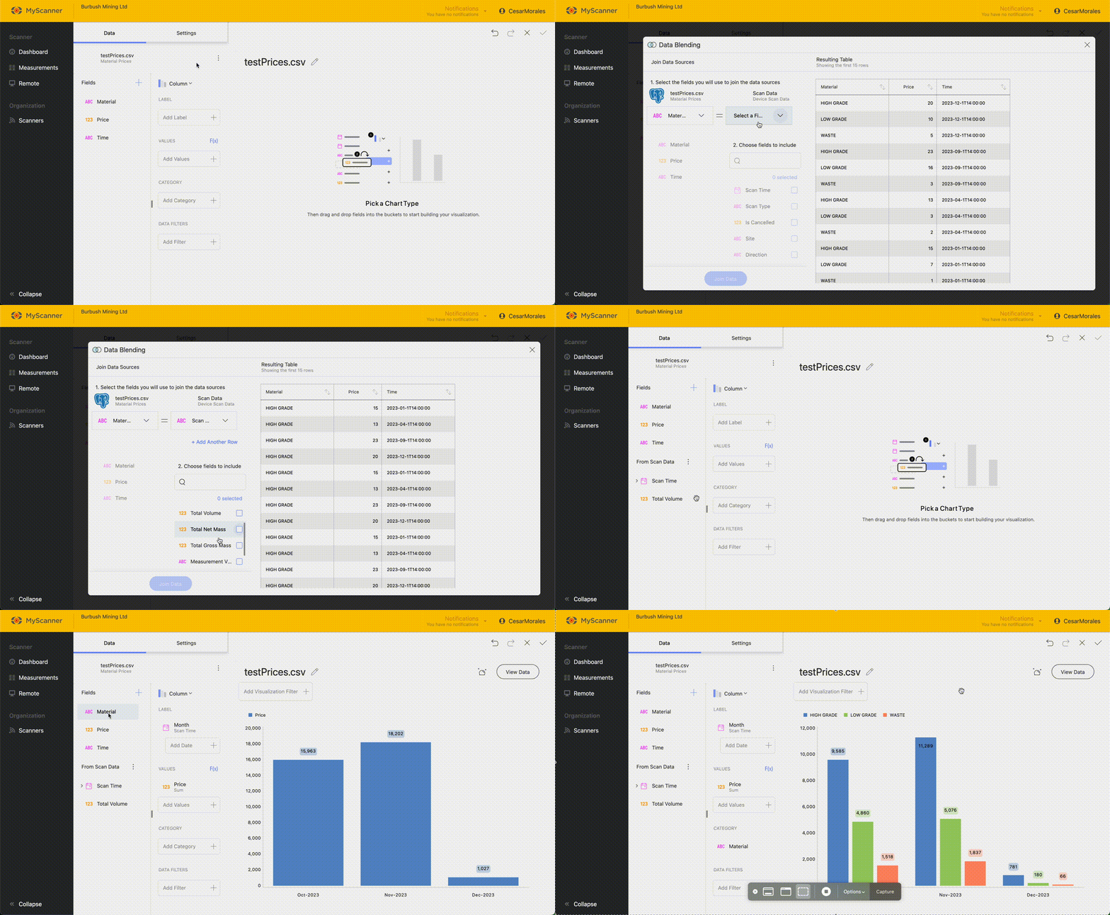
You will see an advanced feature: joining datasources. This connects two data sources based on a identifying value. Material is the identifying value for the
Common Uploading Problems.
Data type is not the expected data type.
Sometimes, the imported data may come in as a datatype you were not expecting. For example: a number field imported as a text field. This will typically mean that one of the values in the uploaded data is not a type which can be compatible with the importing algorithm. Typically this issue happens with “Date” fields. Date fields must be in the ISO8601 format which is essentially “YYYY-MM-DDTHH:MM:SS+timezone” (example here: “2025-04-03T08:37:43+12:00”).
Field names are not named properly.
The CSV that gets imported into MyScanner expects the first row to be the field names. MyScanner will use these names as a label and will not import them into the data. If the field names are appearing incorrectly, make sure the first row within your CSV is your header names that are in the correct positions.
The file will not upload
A potential problem for this is that the file being uploaded is too big for the server to handle. MyScanner limits the CSV filesize to 5 megabytes for any CSV.
Exporting Dashboards
Once you have created a dashboard, you can export that dashboard to a number of different options. There are three types of export currently available:
- Powerpoint
- Excel
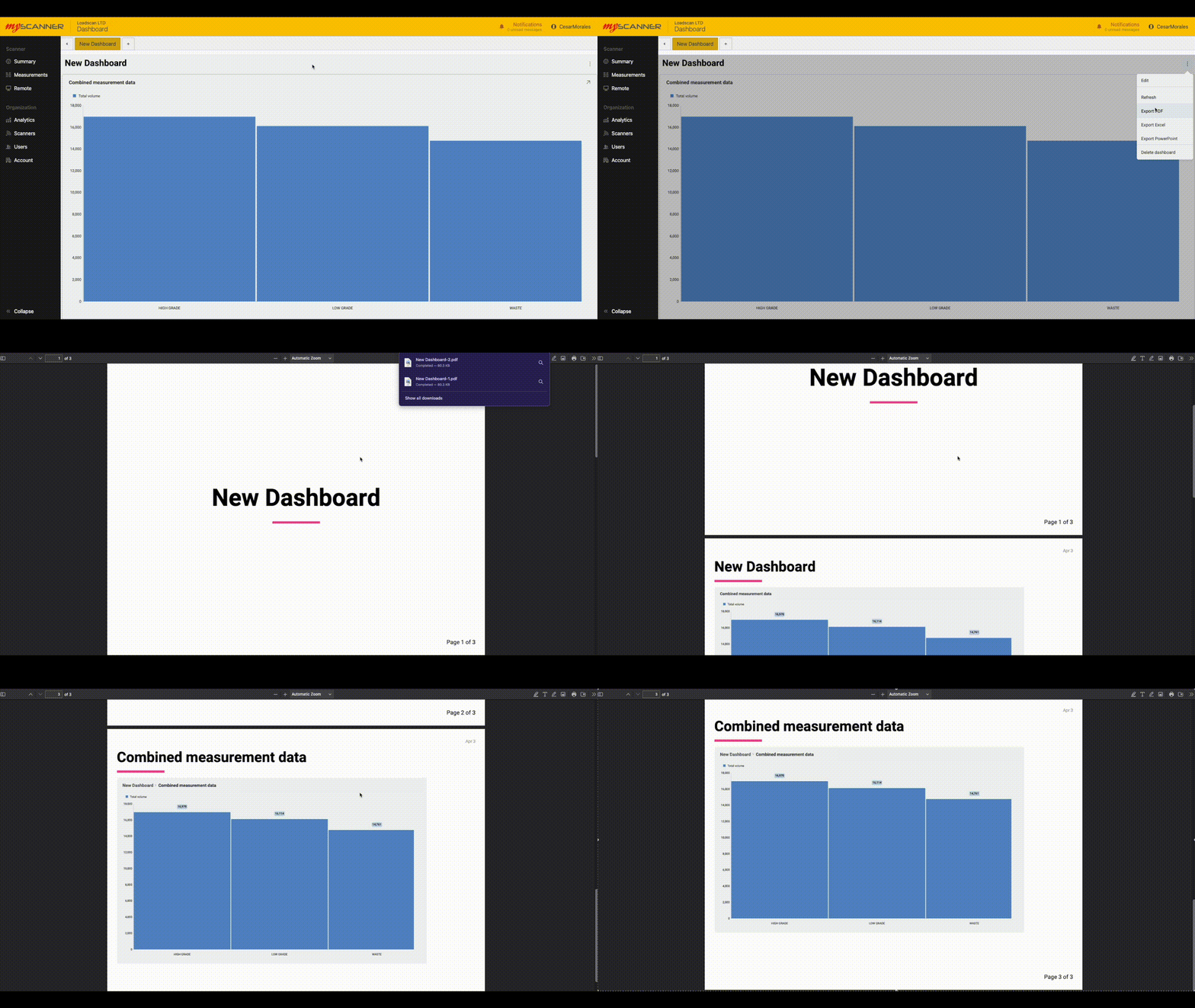
Powerpoint and PDF exports are similar, they will export the dashboard images into individual slides/pages.
Excel exports all the data related to the dashboard as well and creates a graph that is ready to use in excel.
Dashboard Features and FAQ
Dashboards have features that extend the functionality of your analytics from a basic dashboard into an interactive story of your data.
Dashboard Tabs
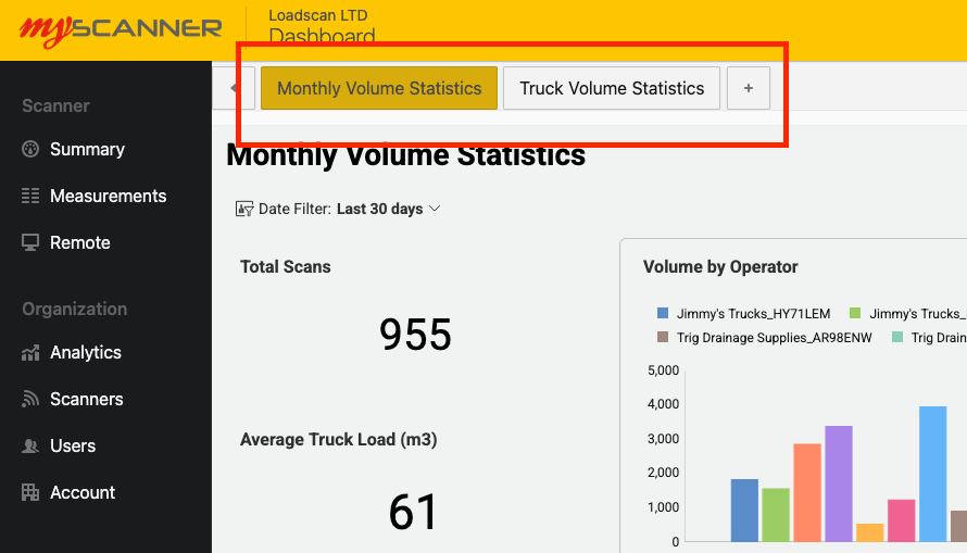
When you first create a dashboard, you will have the option to add more “tabs” to the dashboard. This allows you to make a group of data in which you can create a bit of a story with your own data.
To create a new tab, simply press the + button at the top navigation bar within the page. This will give you two options:
- New dashboard
- Use Template
New dashboard creates a new view to create more visualizations.
Use template allows you to use an existing dashboard template that will auto populate with your own data.
How Data is Processed and Refreshed
Data for dashboards gets optimised for use in the MyScanner Analytics platform. On the first use of a datasource, MyScanner will do some data optimisations that may take a while. You will see a notification appear within the MyScanner notifications that will let you know how far along the optimizations are within the system. This shouldn’t stop you from creating any dashboards but you will notice that data will be missing until the optimization is complete.
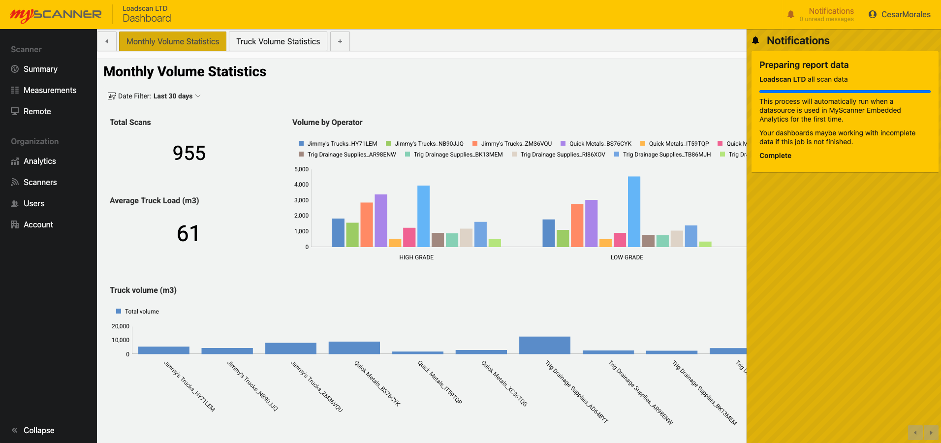
MyScanner also refreshes the data every minute so any changes in regards to new scans or updated information should appear within your dashboards shortly after.
You also have the ability to manually refresh. This allows you to re-populate the dashboard with updated data slightly sooner than letting MyScanner automatically update the data.
Delete Dashboard
You can delete a single dashboard view. This will remove the single dashboard view from the group of dashboards in the dashboard tab.
Visualization Features
Visualizations can have their own unique properties to add value to the data you would like to show. This section will show you some of the ways you can better utilize your data.
Fixed Lines
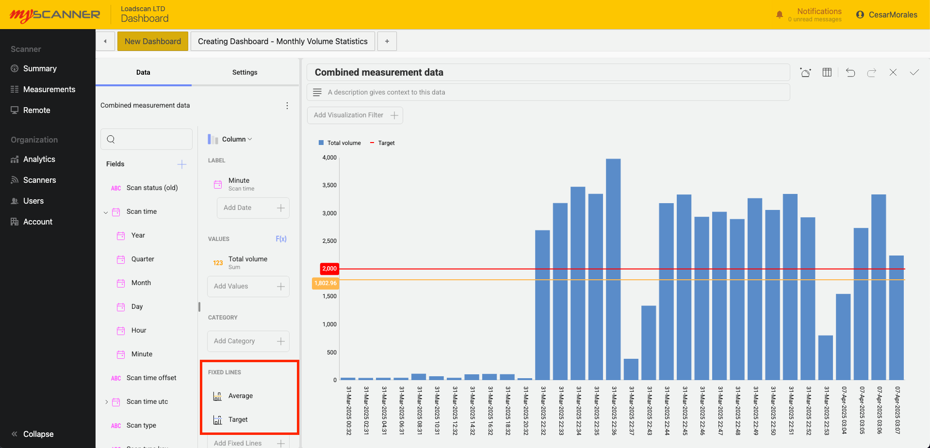
Above you will see an example of using “Fixed Lines” in a column chart. Fixed lines give you the ability to give you four options:
- Highest
- Lowest
- Average
- Fixed Value
Highest, lowest, and average will calculate their position on the chart depending on the values within the chart. In the example above: an Average fixed line shows us the average value between all the data in “Total Volume”.
Fixed value will allow you to create a set line within the data. In this example i have set a target i want to achieve for the total volume scanned.
Filters
Filters give you the ability to narrow down your data and give a more concise visualization of your data. There are three types of filters you can apply to a visualization
- Permanent filter (data filter)
- Editable filter (visualization filter)
- Dashboard filter
Permanent filters
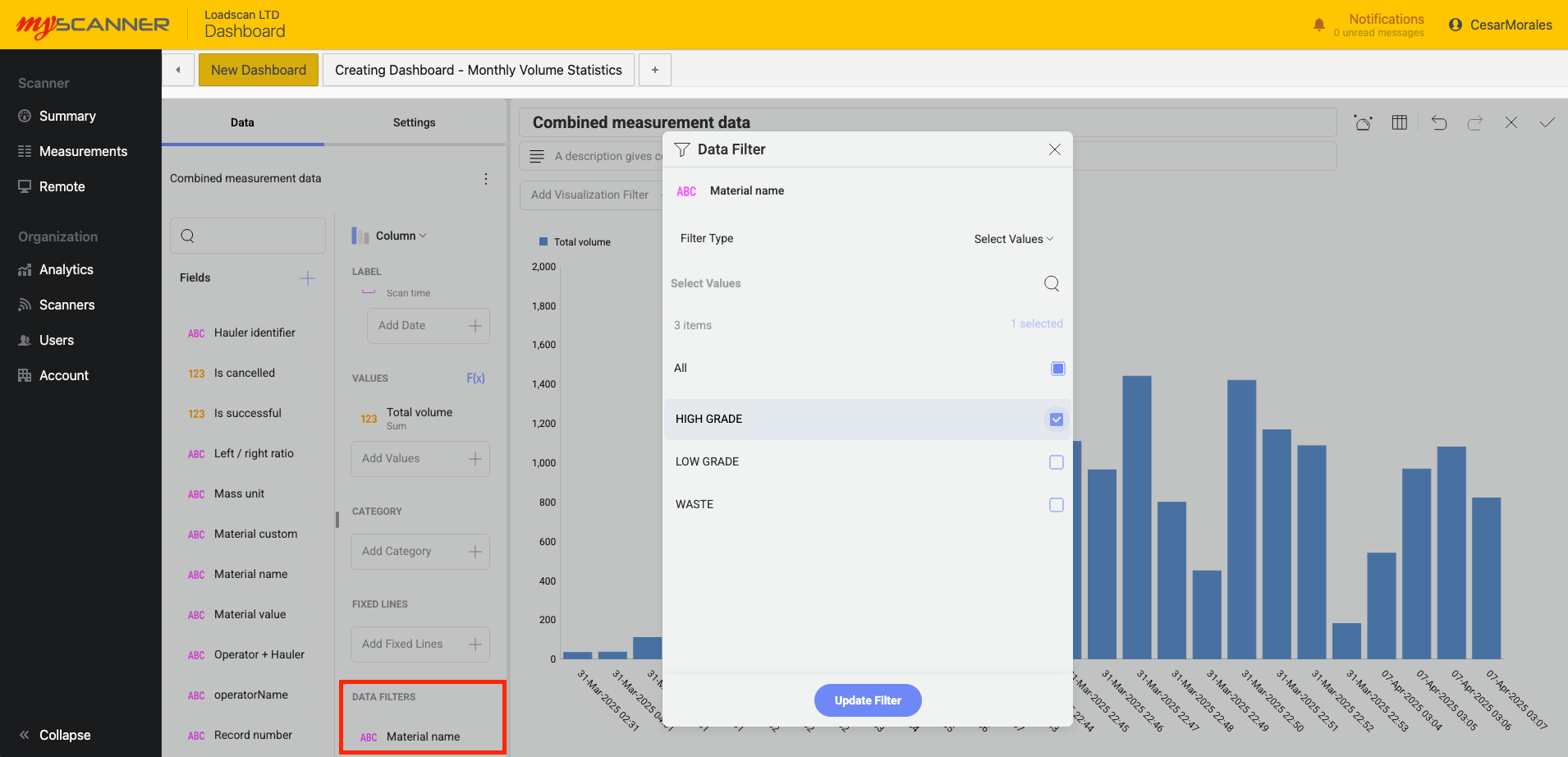
These are defined in the “Data Filters” field editor. This allows you to create a filter in which you do not want dashboard viewers to change or adjust. For example: I only want to show a HIGH GRADE material so i add a filter that only has HIGH GRADE selected.
Editable filters
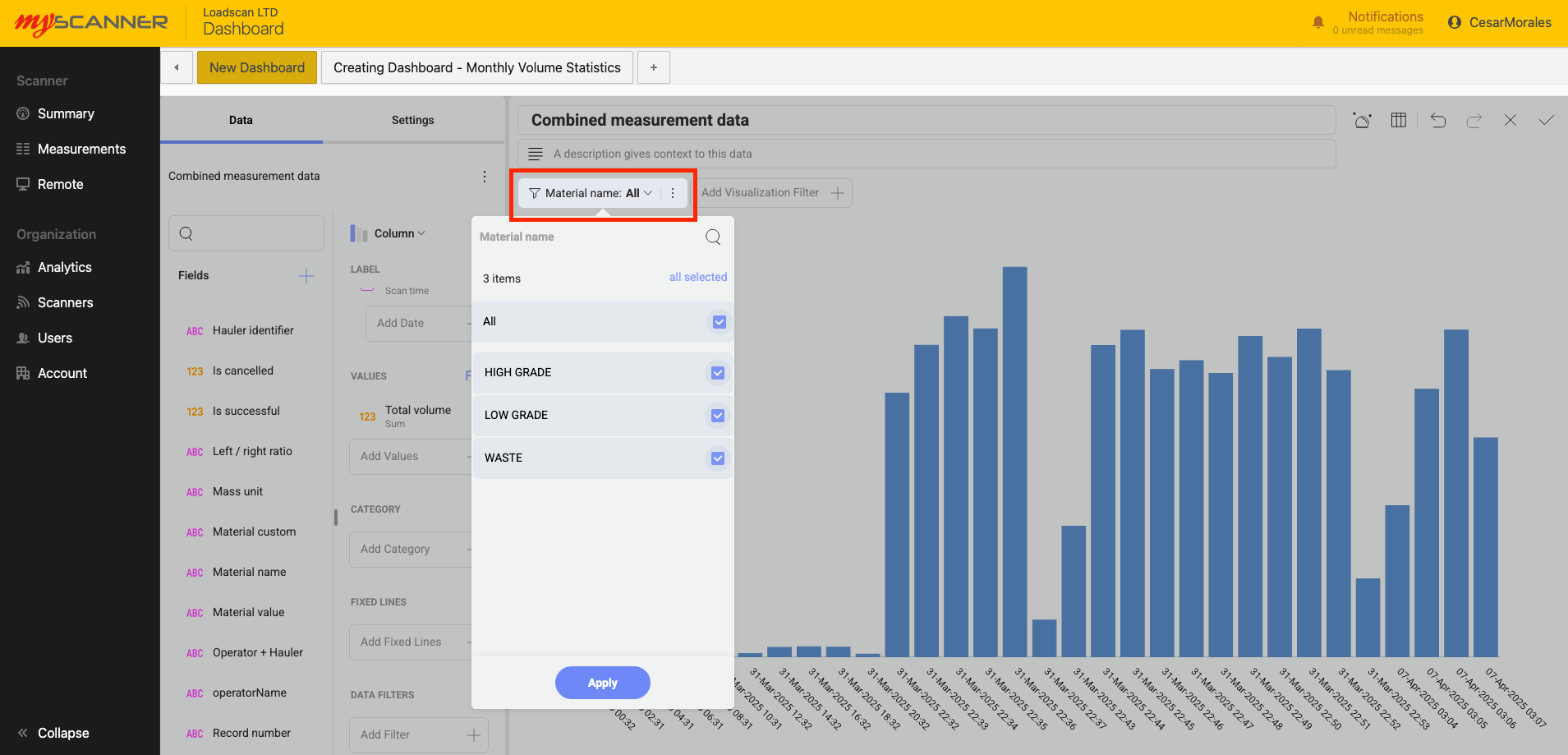
These are filters that a user can change if they would like to see a different option. They offer more freedom for the user since they are a default filter for the visualization. In the example below i can select which values i want as a default. When a user uses this dashboard they can then change the values they want to see without editing the entire dashboard.
Dashboard filters
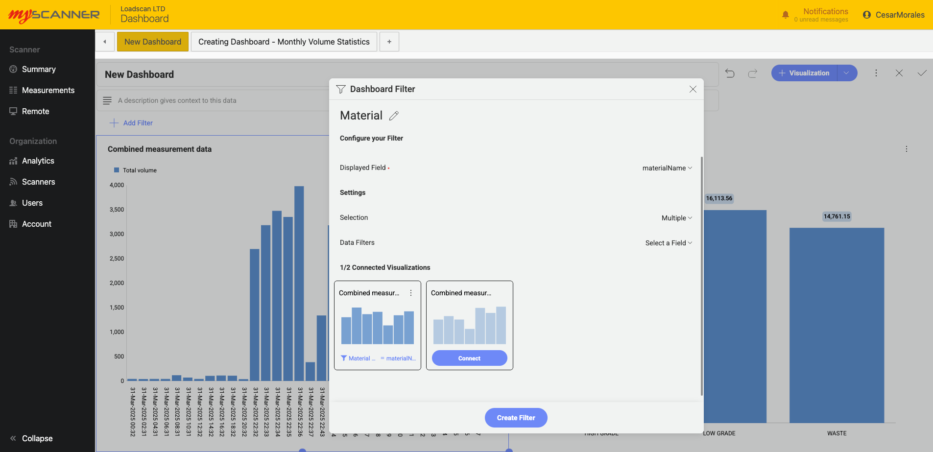
These are similar to editable filters but they can be applied to multiple visualizations to control an entire dashboard. In the example below, A filter can be connected to multiple visualizations so that users can control the entire dashboard instead of making filters one by one on each visualization.
Visualization Types
Visualizations are individual charts that give you some insight into your data. There can be many visualizations within a dashboard and can feature in depth filtering per visualization for anyone to view filtered data.
Every visualization has special functions to allow you to get an in depth look into your data. They are grouped by their unique functionality.
Category Charts

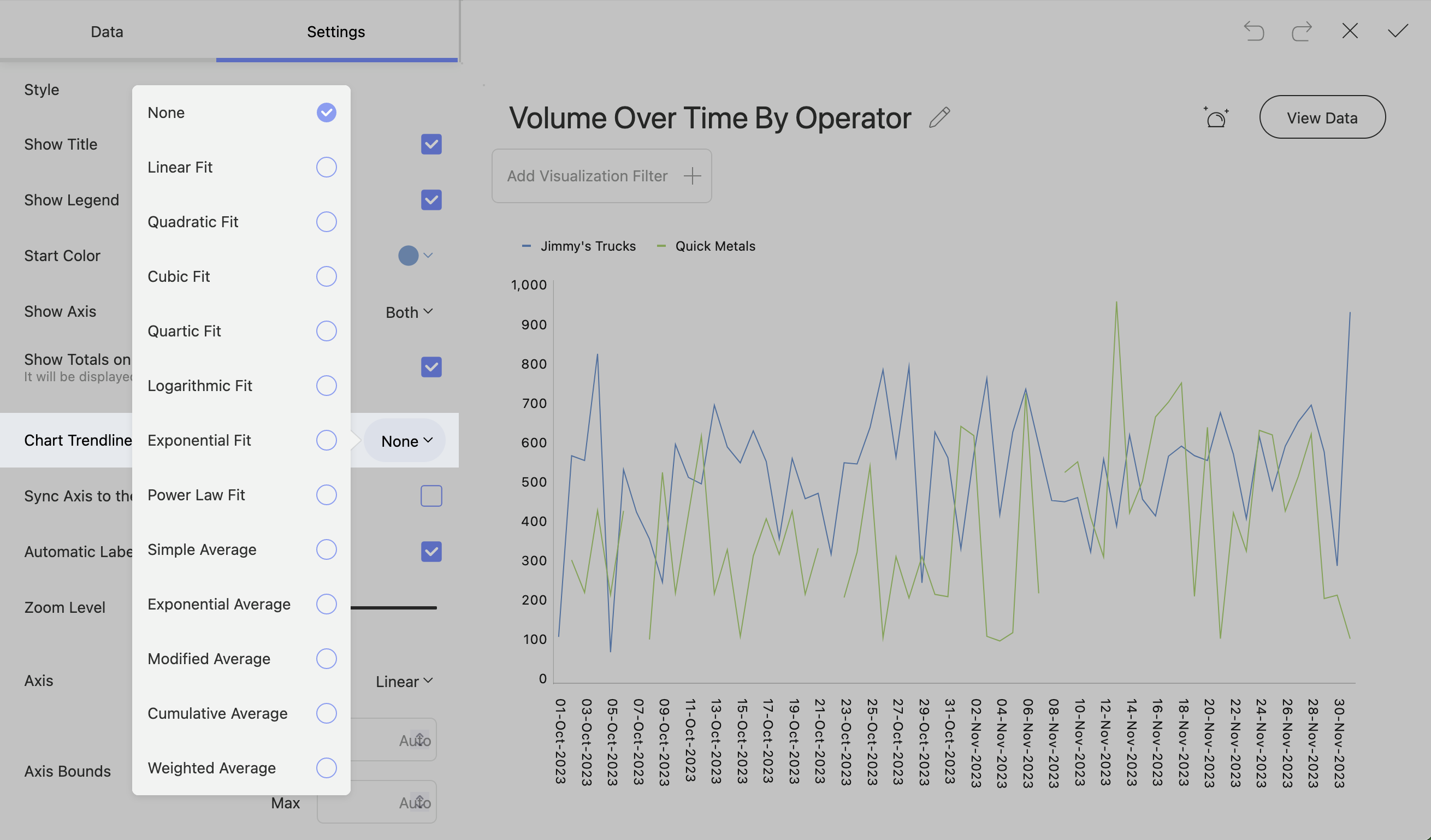
Category charts are charts you will be most familiar with. They provide the ability to see process chart trendlines and statistical functions.
Trendlines
Chart trendlines draw lines across the chart to determine trends in your data. You will see a range of trendline fit algorithims:
Percentage Distribution
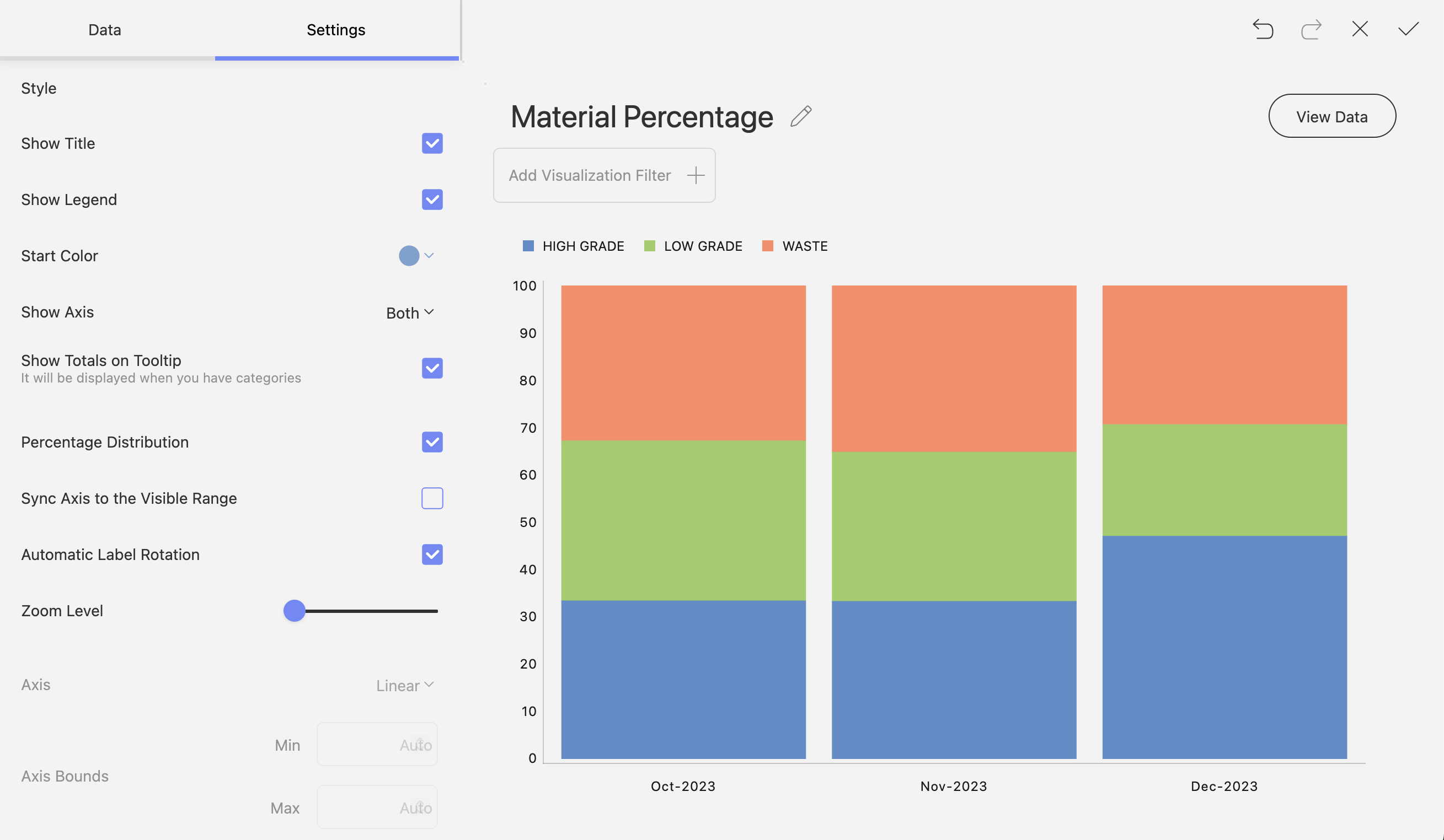
Stacked charts will give you an option to have percentage distribution in the settings. This will change the scale from the default scale to a 0 – 100 scale.
Start Position and Splice Labels
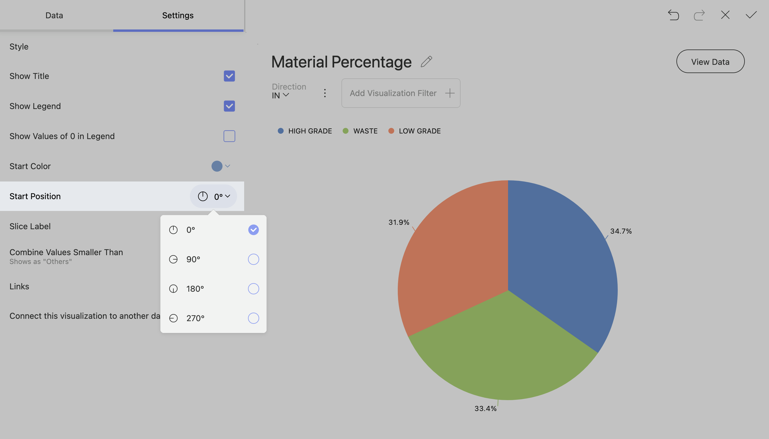
Pie and Doughnut charts have start positions where you can configure where the data percentages start.
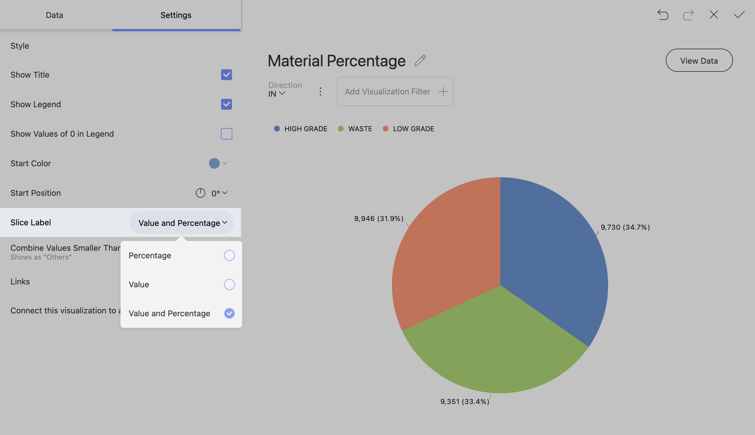
You can change how a slice shows your data. The available slice options are percentage, value, And a combination of value and percentage.
Enabling Pie and Doughnut Chart Legends toShow Elements with Value 0
Note!
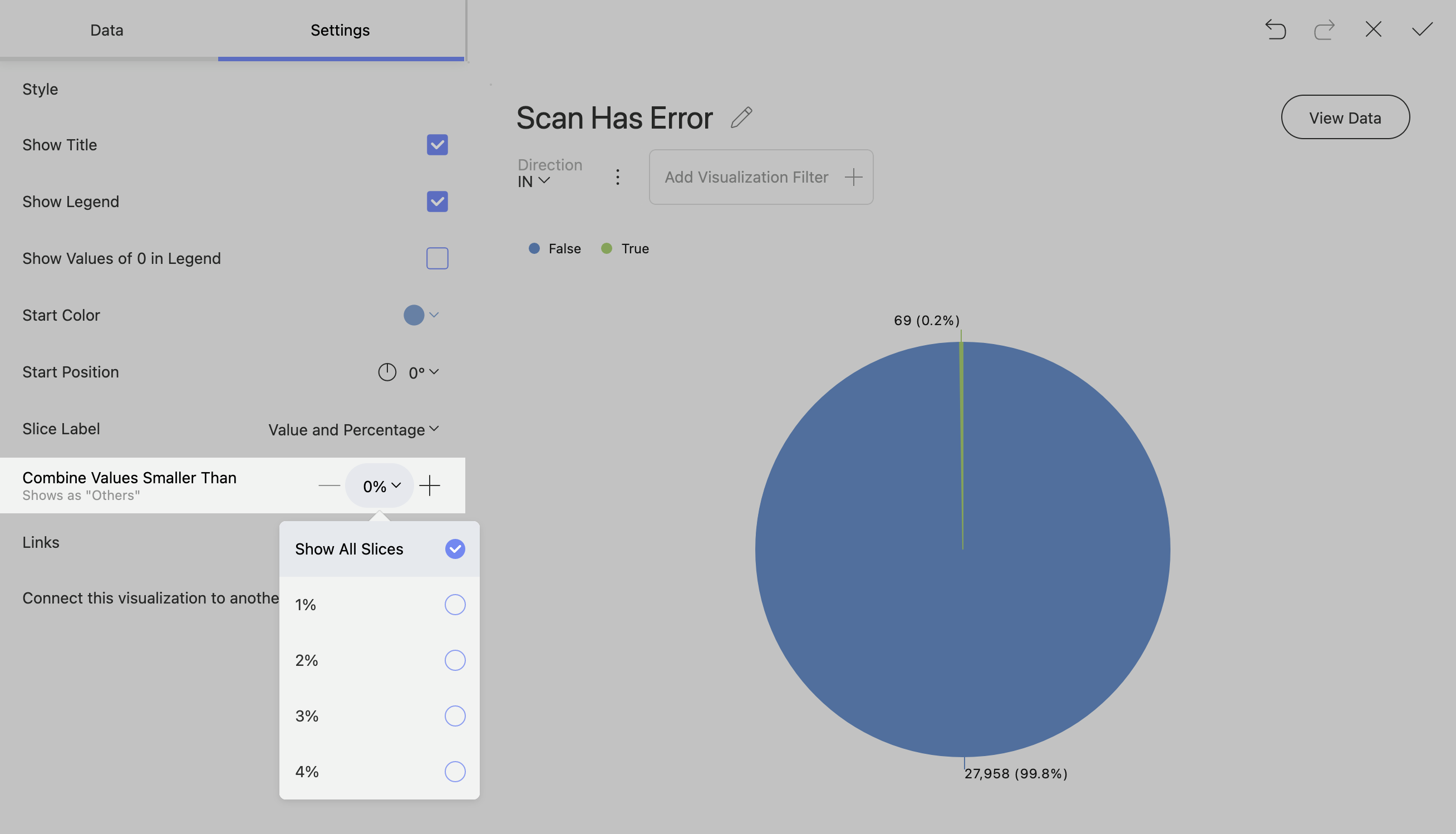
Charts with a lot of small percentages can get crowded and confusing if you show all the slices.
Pie and doughnut charts can often have valuable information within smaller percentages of the chart. To show this information, go to settings and change “Combine Values Smaller Than” to “Show All Slices”.
Gauge Charts
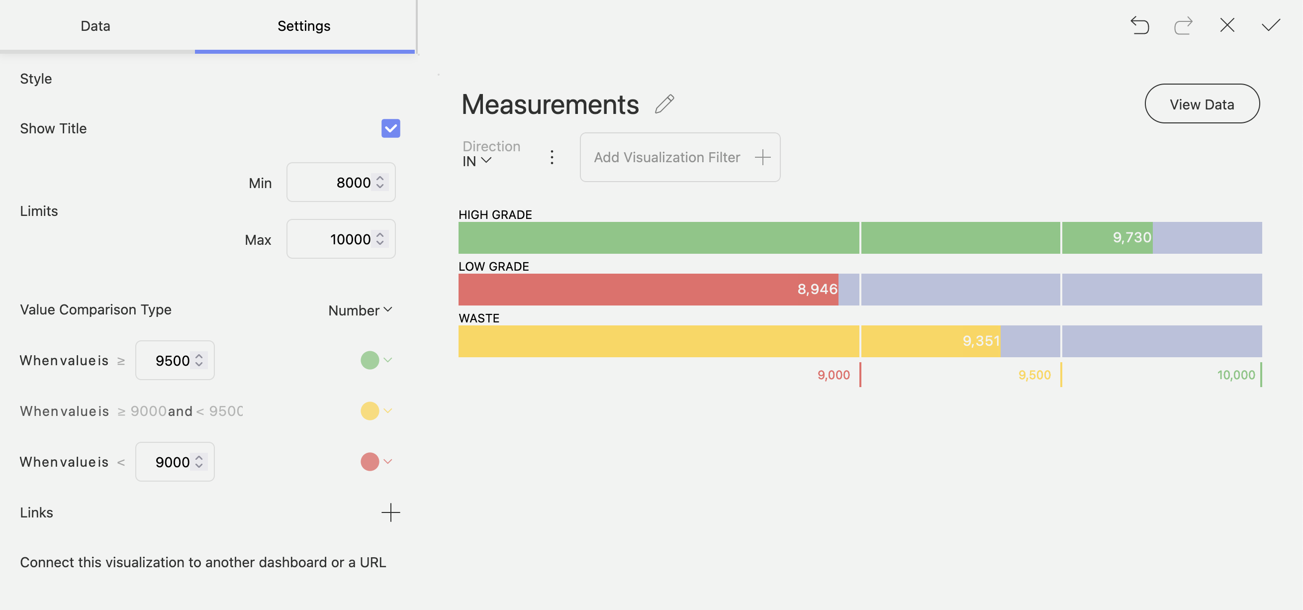
The Gauge chart displays a single value, or a list of values, comparing them with range thresholds. The gauge also allows for conditional formatting of the different ranges.

Linear Gauge
The Linear gauge displays a label, the value of the label in a bar. You can add some bounds in the settings to change the behaviour of the bands.
Bullet Graph
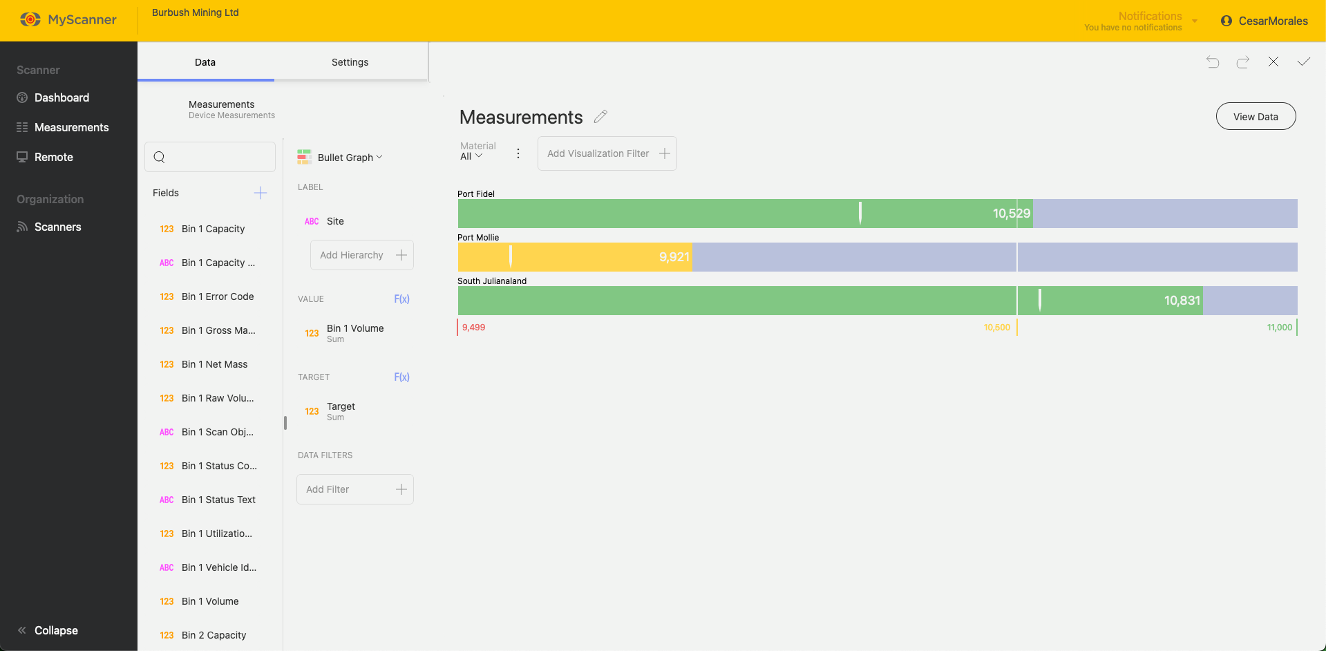
A Bullet graph is similar to the Linear Gauge except it has targets. The targets can be useful to measure the performance of a particular label.
Bands Configuration
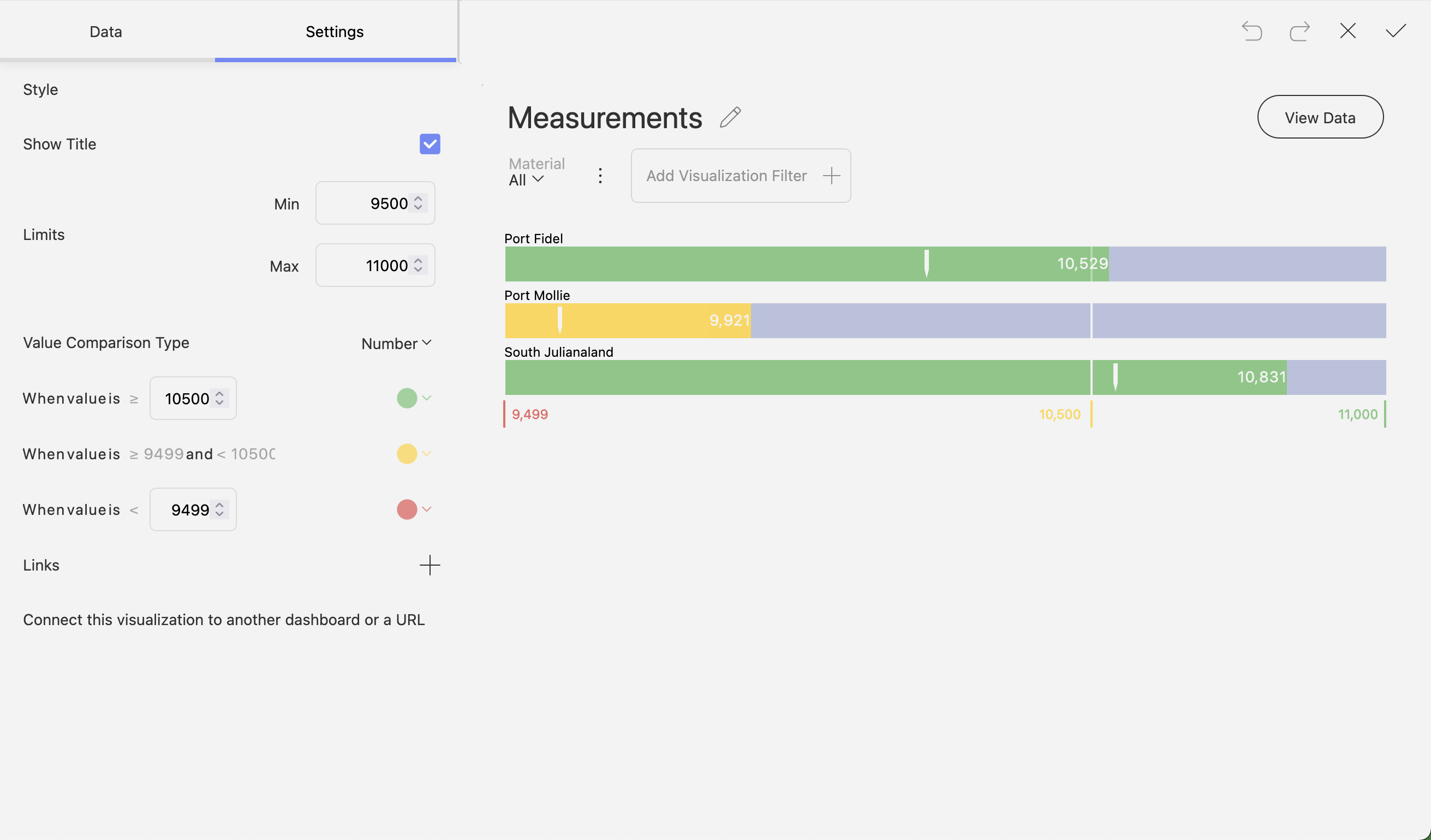
All Gauge charts will have similar configurations to change the behaviour of the bands. You can find these in the Settings while editing a visualization. These settings will allow you to set min/max limits and change how the bands behave with the data provided to it.
Other Charts
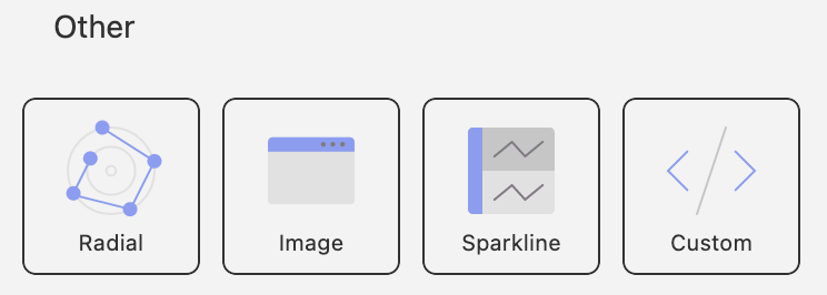
There are a few special chart types within MyScanner dashboarding which can allow you to include extra information.
Radial Chart
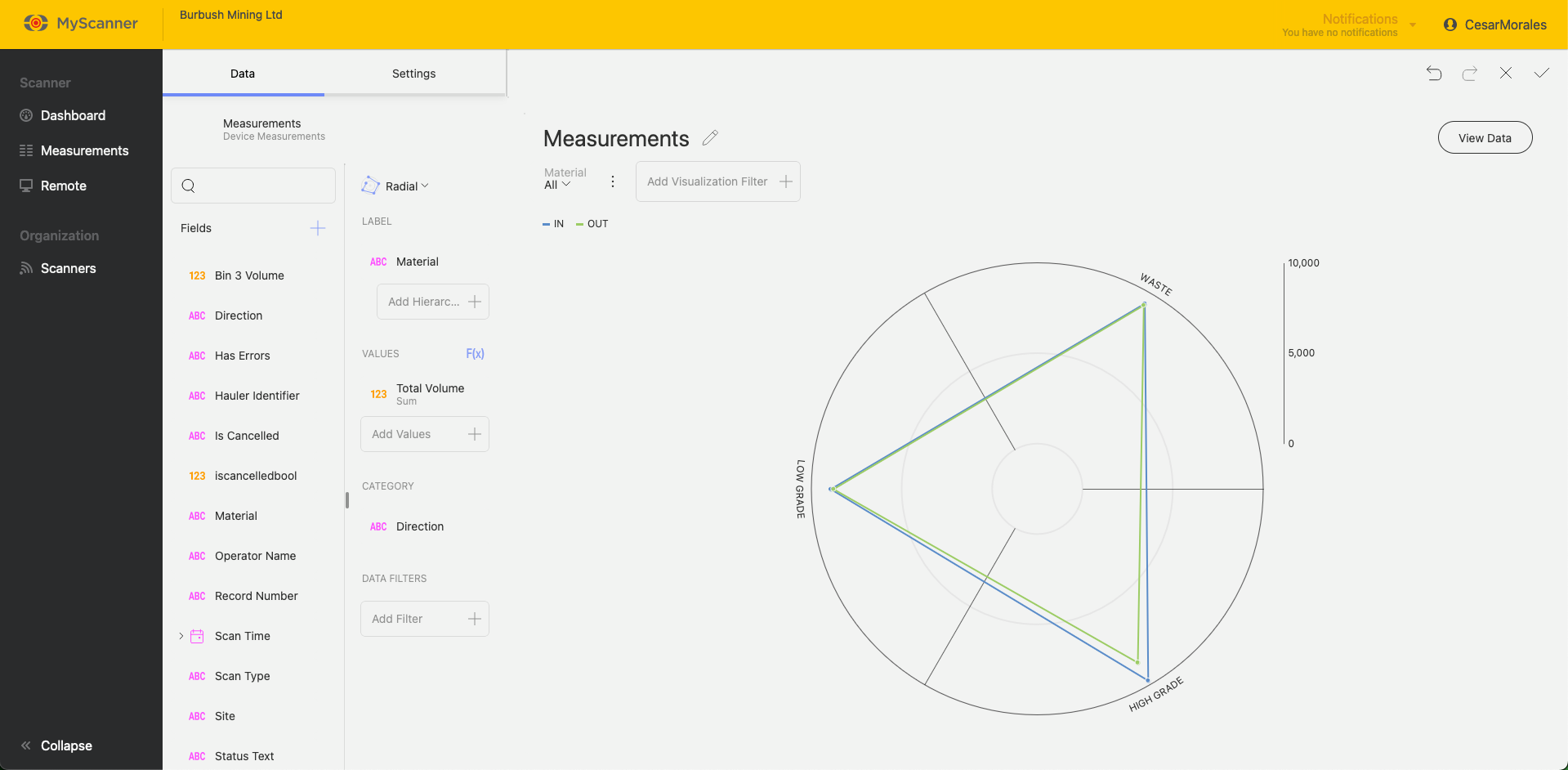
The radial chart acts similar to a standard Category Chart except in a co-ordinate format.
Sparkline
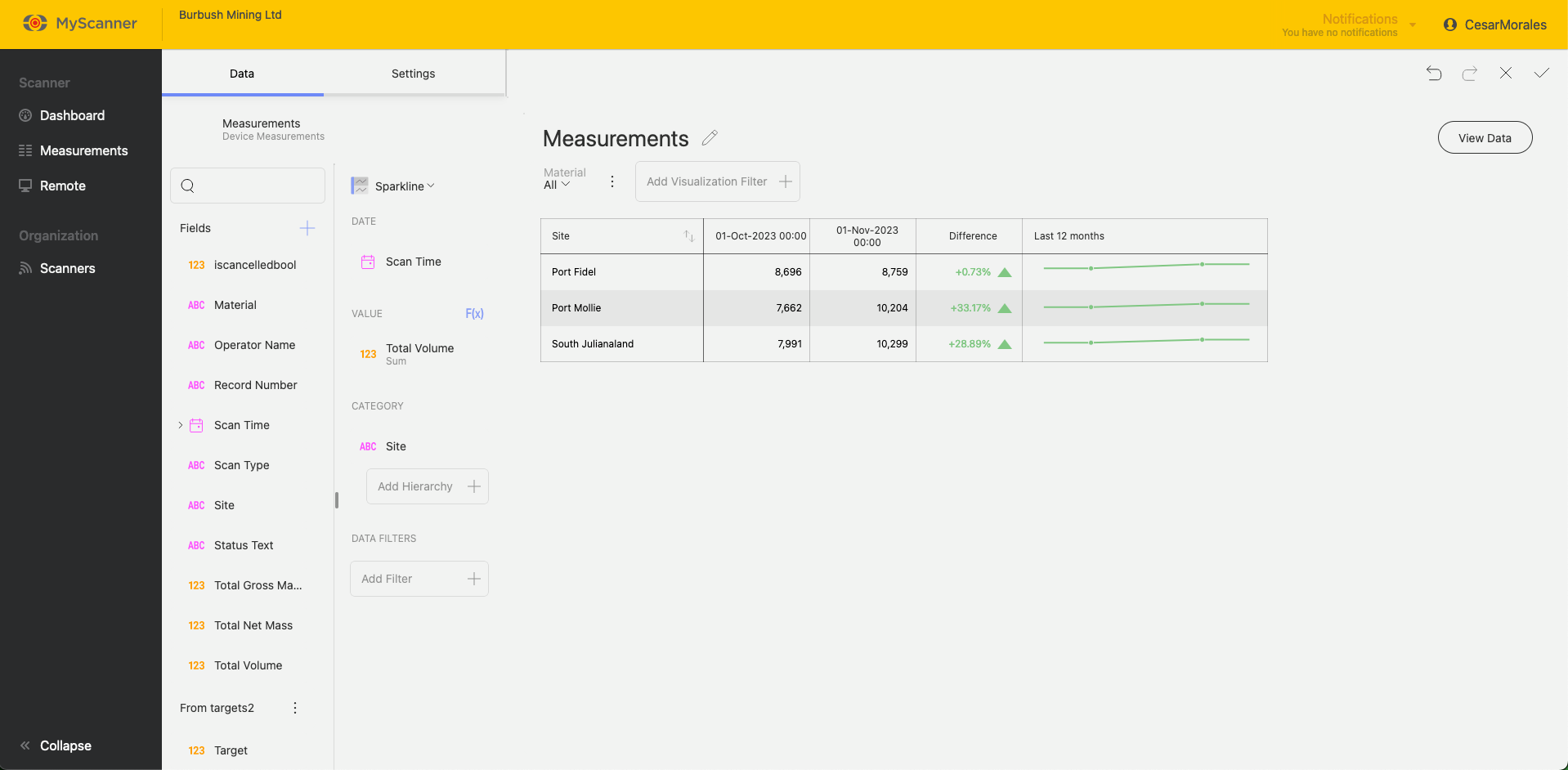
Sparkline visualization is a grid with a small line chart embeded within a grid cell based on values over time.
Custom Visualization
Custom visualizations allow you to include web pages that can be interacted with. You just need a URL and the MyScanner dashboarding will try to display the link as if you were using the web page on your browser.
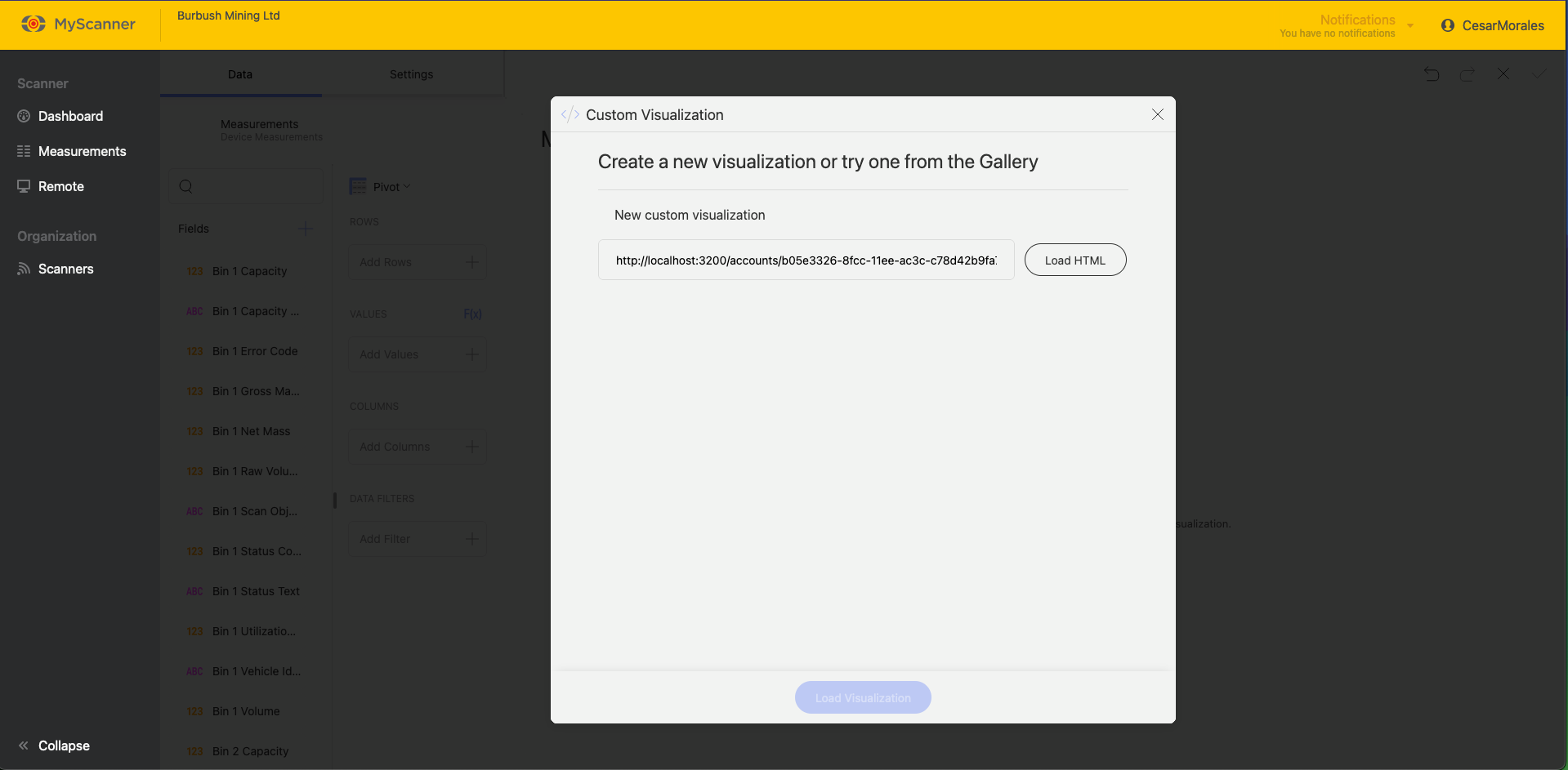
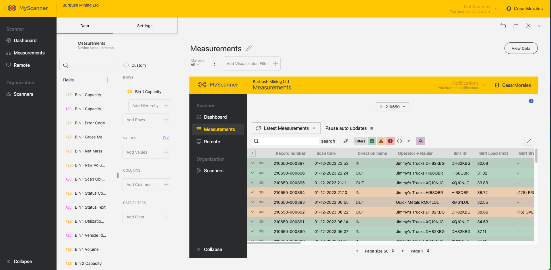
You will still need to include a value in the Rows section to allow the linked URL to display.
In this Article
Note!
The Myscanner Analytics are only available to users who have purchased the add-on.
Users
Basic Users
Basic users will need an admin to create a dashboard and either set the dashboard as the default dashboard across the organization, or “favourite” the dashboard themselves. Basic users will only be able to view dashboards and favourite dashboards that are made available to them.
Scan Editors/Admin users
Admin users will have all the same permissions as basic users but will have extra privileges such as creating, and editing dashboards.
View Dashboards
To view dashboards available to you, select the “Analytics” menu item from the left menu. This will open a sub-menu where you can manage anything related to Embedded Analytics


Basic users will be able to view dashboards, and favourite ![]() dashboards which will set the default home page view to the favourite dashboard.
dashboards which will set the default home page view to the favourite dashboard.
Admin users These users will still have the same features as basic users but will be able to create and edit dashboards. They will also have the ability to upload custom data and use previous templates.
Creating a Dashboard
Note!
This section will only be relevant to an organization admin.
To create a dashboard you will need to view dashboards and click the Create Dashboard Group Button ![]() .
.
This will open a prompt where you will enter the name and a description of the dashboard you will create. After giving the dashboard a name, you will see a screen like so:

Adding a Visualization
To add a Visualization, click the blue button ![]() and it will open a dialog with some options.
and it will open a dialog with some options.

All the different tabs are groups of data types.
- Account Datsource: This is a set of datasources that combine closely related data from multiple devices.
- Device Datasource: This is a set of datasources that will be specific to one device.
- Uploaded Data: This is where you use data that has been uploaded from the “Uploaded Data” page. Uploaded data gives you the opportunity to link your own custom data to myscanner data.
- Dashboard Templates: These are entire dashboard templates that will overwrite the existing dashboard. If you select a dashboard template a selection of pre made visualizations will be created and auto-populated based on your own devices and data.
Editing a Visualization
You can drag and drop the fields or click on an option to add the field into different categories.
NOTE!
Different Charts will show different options so play around with the options and try out the different charts.

You can also adjust the settings of a visualization. Click the Settings button on the top left of the editing screen and take a look at the options available.

When you have finished making your visualization press the Save ![]() button. You can also Cancel
button. You can also Cancel ![]() your dashboard visualization or undo or redo
your dashboard visualization or undo or redo ![]() any changes.
any changes.
Saving the Dashboard
Note!
The dashboards do not auto-save, so make sure you save frequently if you are making a lot of changes.
Once you have made a visualization, you can save the dashboard. Simply press the tick ![]() at the top left to save the dashboard.
at the top left to save the dashboard.
Using Dashboard Templates
Note!
This section will only be relevant to an organization admin.
Dashboard templates are an easy way to get started. They are pre-made dashboards that will auto populate with your own data and give you a good starting place to start using dashboards in an effective way. Over time more and more dashboard templates will be added to MyScanner. When using the templates, make sure to save any dashboard you are currently working on. To start using the templates, simply click on “Visualizations” and then navigate to “Dashboard Templates”. This will show you a list of different templates with short descriptions. If you click on one of the templates, MyScanner will automatically create a new dashboard tab with all the data populated with your own data. Below is an example of using one of the templates:

Adding a Visualization
To add a Visualization, click the blue button ![]() and it will open a dialog with some options.
and it will open a dialog with some options.

All the different tabs are groups of data types.
- Account Datsource: This is a set of datasources that combine closely related data from multiple devices.
- Device Datasource: This is a set of datasources that will be specific to one device.
- Uploaded Data: This is where you use data that has been uploaded from the “Uploaded Data” page. Uploaded data gives you the opportunity to link your own custom data to myscanner data.
- Dashboard Templates: These are entire dashboard templates that will overwrite the existing dashboard. If you select a dashboard template a selection of pre made visualizations will be created and auto-populated based on your own devices and data.
Editing a Visualization
You can drag and drop the fields or click on an option to add the field into different categories.
NOTE!
Different Charts will show different options so play around with the options and try out the different charts.

You can also adjust the settings of a visualization. Click the Settings button on the top left of the editing screen and take a look at the options available.

When you have finished making your visualization press the Save ![]() button. You can also Cancel
button. You can also Cancel ![]() your dashboard visualization or undo or redo
your dashboard visualization or undo or redo ![]() any changes.
any changes.
Saving the Dashboard
Note!
The dashboards do not auto-save, so make sure you save frequently if you are making a lot of changes.
Once you have made a visualization, you can save the dashboard. Simply press the tick ![]() at the top left to save the dashboard.
at the top left to save the dashboard.
Managing Custom Data
Uploading Data
You can upload your own data to our dashboards that can work with MyScanner data. You will need to format your data into a CSV file. To upload a datasource, you must first save your dashboard, navigate to “Uploaded Data” and then upload a datasource from the page. You will need to then select a file to upload. Big files will take longer to upload and process within the system. Try to keep your files small so you don’t see any slowdowns.

Once uploaded, You can start using the data as if it were any other data source.
Here is an example of joining our uploaded data to current scan data.

This is a pre-uploaded example.
Once uploaded, You can start using the data as if it were any other data source.
Here is an example of joining our uploaded data to current scan data.

You will see an advanced feature: joining datasources. This connects two data sources based on a identifying value. Material is the identifying value for the
Common Uploading Problems.
Data type is not the expected data type.
Sometimes, the imported data may come in as a datatype you were not expecting. For example: a number field imported as a text field. This will typically mean that one of the values in the uploaded data is not a type which can be compatible with the importing algorithm. Typically this issue happens with “Date” fields. Date fields must be in the ISO8601 format which is essentially “YYYY-MM-DDTHH:MM:SS+timezone” (example here: “2025-04-03T08:37:43+12:00”).
Field names are not named properly.
The CSV that gets imported into MyScanner expects the first row to be the field names. MyScanner will use these names as a label and will not import them into the data. If the field names are appearing incorrectly, make sure the first row within your CSV is your header names that are in the correct positions.
The file will not upload
A potential problem for this is that the file being uploaded is too big for the server to handle. MyScanner limits the CSV filesize to 5 megabytes for any CSV.
Exporting Dashboards
Once you have created a dashboard, you can export that dashboard to a number of different options. There are three types of export currently available:
- Powerpoint
- Excel

Powerpoint and PDF exports are similar, they will export the dashboard images into individual slides/pages.
Excel exports all the data related to the dashboard as well and creates a graph that is ready to use in excel.
Dashboard Features and FAQ
Dashboards have features that extend the functionality of your analytics from a basic dashboard into an interactive story of your data.
Dashboard Tabs
When you first create a dashboard, you will have the option to add more “tabs” to the dashboard. This allows you to make a group of data in which you can create a bit of a story with your own data.
To create a new tab, simply press the + button at the top navigation bar within the page. This will give you two options:
- New dashboard
- Use Template
New dashboard creates a new view to create more visualizations.
Use template allows you to use an existing dashboard template that will auto populate with your own data.

How Data is Processed and Refreshed
Data for dashboards gets optimised for use in the MyScanner Analytics platform. On the first use of a datasource, MyScanner will do some data optimisations that may take a while. You will see a notification appear within the MyScanner notifications that will let you know how far along the optimizations are within the system. This shouldn’t stop you from creating any dashboards but you will notice that data will be missing until the optimization is complete.

MyScanner also refreshes the data every minute so any changes in regards to new scans or updated information should appear within your dashboards shortly after.
You also have the ability to manually refresh. This allows you to re-populate the dashboard with updated data slightly sooner than letting MyScanner automatically update the data.
Delete Dashboard
You can delete a single dashboard view. This will remove the single dashboard view from the group of dashboards in the dashboard tab.
Visualization Features
Visualizations can have their own unique properties to add value to the data you would like to show. This section will show you some of the ways you can better utilize your data.
Fixed Lines

Above you will see an example of using “Fixed Lines” in a column chart. Fixed lines give you the ability to give you four options:
- Highest
- Lowest
- Average
- Fixed Value
Highest, lowest, and average will calculate their position on the chart depending on the values within the chart. In the example above: an Average fixed line shows us the average value between all the data in “Total Volume”.
Fixed value will allow you to create a set line within the data. In this example i have set a target i want to achieve for the total volume scanned.
Filters
Filters give you the ability to narrow down your data and give a more concise visualization of your data. There are three types of filters you can apply to a visualization
- Permanent filter (data filter)
- Editable filter (visualization filter)
- Dashboard filter
Permanent filters
These are defined in the “Data Filters” field editor. This allows you to create a filter in which you do not want dashboard viewers to change or adjust. For example: I only want to show a HIGH GRADE material so i add a filter that only has HIGH GRADE selected.

Editable filters
These are filters that a user can change if they would like to see a different option. They offer more freedom for the user since they are a default filter for the visualization. In the example below i can select which values i want as a default. When a user uses this dashboard they can then change the values they want to see without editing the entire dashboard.

Dashboard filters
These are similar to editable filters but they can be applied to multiple visualizations to control an entire dashboard. In the example below, A filter can be connected to multiple visualizations so that users can control the entire dashboard instead of making filters one by one on each visualization.

Visualization Types
Visualizations are individual charts that give you some insight into your data. There can be many visualizations within a dashboard and can feature in depth filtering per visualization for anyone to view filtered data.
Every visualization has special functions to allow you to get an in depth look into your data. They are grouped by their unique functionality.
Category Charts

Category charts are charts you will be most familiar with. They provide the ability to see process chart trendlines and statistical functions.
Trendlines
Chart trendlines draw lines across the chart to determine trends in your data. You will see a range of trendline fit algorithims:

Percentage Distribution
Stacked charts will give you an option to have percentage distribution in the settings. This will change the scale from the default scale to a 0 – 100 scale.

Start Position and Splice Labels
Pie and Doughnut charts have start positions where you can configure where the data percentages start.

You can change how a slice shows your data. The available slice options are percentage, value, And a combination of value and percentage.

Enabling Pie and Doughnut Chart Legends toShow Elements with Value 0
Note!
Charts with a lot of small percentages can get crowded and confusing if you show all the slices.
Pie and doughnut charts can often have valuable information within smaller percentages of the chart. To show this information, go to settings and change “Combine Values Smaller Than” to “Show All Slices”.

Gauge Charts
The Gauge chart displays a single value, or a list of values, comparing them with range thresholds. The gauge also allows for conditional formatting of the different ranges.

Linear Gauge
The Linear gauge displays a label, the value of the label in a bar. You can add some bounds in the settings to change the behaviour of the bands.

Bullet Graph
A Bullet graph is similar to the Linear Gauge except it has targets. The targets can be useful to measure the performance of a particular label.

Bands Configuration
All Gauge charts will have similar configurations to change the behaviour of the bands. You can find these in the Settings while editing a visualization. These settings will allow you to set min/max limits and change how the bands behave with the data provided to it.

Other Charts

There are a few special chart types within MyScanner dashboarding which can allow you to include extra information.
Radial Chart
The radial chart acts similar to a standard Category Chart except in a co-ordinate format.

Sparkline
Sparkline visualization is a grid with a small line chart embeded within a grid cell based on values over time.

Custom Visualization
Custom visualizations allow you to include web pages that can be interacted with. You just need a URL and the MyScanner dashboarding will try to display the link as if you were using the web page on your browser.


You will still need to include a value in the Rows section to allow the linked URL to display.
